Visualisation Recommender Systems
Consider the amount of work that goes into creating a good data visualisation. It requires a combination of technical skills, understanding of design principles, and time to refine the visualisation. However, as design principles move from an art to a science (Moody 2009), will it someday be possible to automate the design process entirely?
This review will begin with a brief background on visualisation grammars and design principles, then examine the state of the art in Visualisation Recommenders (also called “automated visualisation design” systems) that attempt to automatically generate the ‘best’ visualisation(s) for a given dataset.
Visualisation Grammars
 Semiology of Graphics (English translation). Book ©1983 UW Press.
Above: Bertin describes the 8 “visual variables”:
Semiology of Graphics (English translation). Book ©1983 UW Press.
Above: Bertin describes the 8 “visual variables”: x and y planar dimensions; size; value; texture; colour; orientation; and shape. These form the basis for formal visualisation grammars that can be systematically explored.
Visualisation grammars allow designers to declaratively specify which visual properties (referred to as visual variables by Bertin) to use for each field in their dataset. E.g, when analysing fuel efficiency data for different classes of vehicles, the designer might chose to use colour to represent the class of vehicle, which they specify as colour = class. Frameworks supporting the visualisation grammar can automatically render these specifications, which frees designers from the need to write any graphics drawing code.
Data scientists who use the R statistical computing environment will likely be familiar with the ggplot2 visualisation grammar (Wickham 2010) for describing statistical plots. Ggplot2 was inspired by the Grammar of Graphics (Wilkinson 2005), which is in turn was inspired by the cartographic visualisation theory developed in Bertin’s classic work, the Semiology of Graphics (Bertin 1983).
While Bertin was constrained by the limits of a static sheet of paper, Vega and Vega-Lite (Satyanarayan 2017) incorporate user interaction as part of the grammar. Vega is a visualisation grammar expressed in JSON format for creating web visualisations. Vega-Lite builds on top of Vega to provide a higher-level visualisation grammar that translates into Vega.
Vega-Lite sacrifices some expressive power (i.e., the ability to express certain types of visualisations) in exchange for conciseness. Nevertheless, the limits of Vega-Lite help make systematic exploration of its design space computationally feasible, which has led it to become a popular choice of grammar for visualisation recommender systems.
Design Principles
Visualisation grammars provide the flexibility to describe arbitrary visualisation designs (subject to the expressive power of the grammar), but not all designs are good. A good design considers humans perception and cognition to ensure that it can be read efficiently and accurately. E.g., careful use of colour can help relevant information appear to pop out. A bad design can lead to misconceptions or the reader needing to visually scan the entire visualisation like a ‘Where’s Wally/Waldo?’ puzzle.
Over time, researchers and practitioners have proposed design principles and heuristics to distinguish between good and bad designs. E.g., guidelines proposed for visual representations of software models (a form of network visualisation) include “use visual representations whose appearance suggests their meaning”, “shape should be used as the primary visual variable for distinguishing between different semantic constructs”, and “color can only be used for nominal data” (Moody 2009).
Recommenders
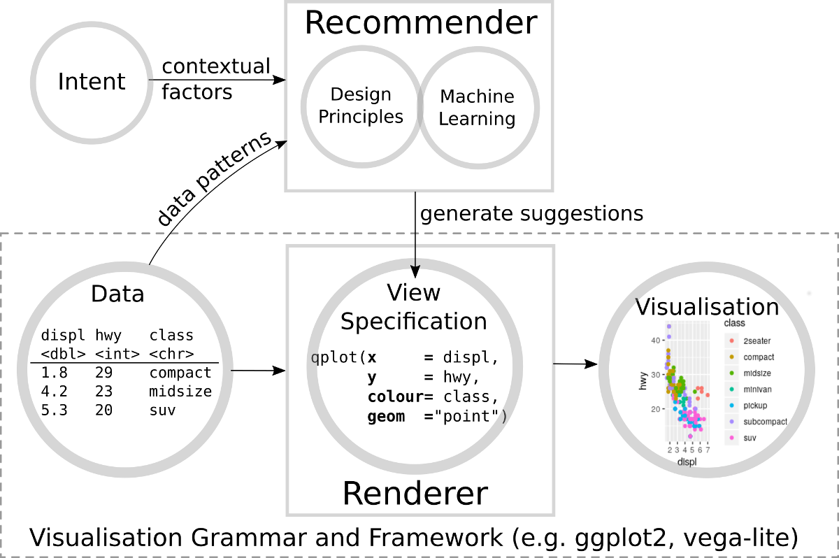 Above: Visualisation Recommender Systems automate the step of writing a view specification, allowing the user to rapidly visualise their data without the need to learn a visualisation grammar or framework.
The idea behind Visualisation Recommender Systems is to enumerate all possible view specifications expressible in a visualisation grammar, then evaluate them against established design principles and heuristics to find the best visualisation for a given dataset (Mackinlay 1986). Recent vision papers have called for a visualisation “utility function” (Obie 2017) or “objective function” (Degbelo 2018) incorporating not just design principles, but also user understanding.
However, a consideration of the factors that should influence the visualisation selection reveals that visualisation recommendation is non-trivial:
- The suitability of a visualisation depends on the design intent (what question should the visualisation help answer? Who is viewing the visualisation? What prior knowledge do they have?). The intent may be only partially understood by the user, or not in a form that the user can express. Ideally the recommender should attempt to use contextual factors to infer the user intent and take this into account.
- The visualisation should be suited not just to the data type, but also the data distribution. Manual exploratory analysis allows users to visually uncover interesting patterns that are unexpected or difficult to formally describe. Automating this process requires pre-programming the recommender engine with a full list of data patterns (min, max, mean, skew, distinct values, entropy, trends, outliers, correlations, etc.) to consider in the evaluation.
- Current visualisation design principles and heuristics have not reached the level of scientific maturity to provide a unified scoring mechanism, and some principles may not even have been discovered yet. As such, recommenders need some form of machine learning to infer missing design rules from a visualisation corpus and to learn how to weight competing design heuristics.
Recent Research
Draco (Moritz 2019) incorporates design principles as a set of constraints. The treatment of visualisation recommendation as a constraint satisfaction problem is a well-established approach that dates back to the APT system (Mackinlay 1986). Draco allows soft-constraints that may be violated, and associated weights to represent the cost of constraint violation. In contrast to APT, Draco has the ability to learn the appropriate weight for soft-constraints from data in order to help make decisions between conflicting heuristics. These weights are learned using the RankSVM algorithm, which learns from pairs of visualisations manually labelled with which visualisation in the pair is preferable. Constraints are expressed in a logic programming language (Answer Set Programming), which allows design principles and heuristics to be conditioned on predicates provided by the user. For example, Draco uses predicates to condition the visualisation on column statistics and user provided contextual factors (such as column importance and task type). Draco generates view specifications in the Vega-Lite grammar. While Vega-Lite itself supports interaction and geographic maps, Draco only searches a subset of the Vega-Lite grammar, and does not currently appear to support these features. Nevertheless, the authors of Draco note “interaction primitives” as future work.
 Above: Screenshot of the Draco editor. The left panel allows the user to enter constraints. The right panel recommends visualisations that best satisfy both the constraints specified by the user and its internal database of design principle constraints.
DeepEye (Luo 2018) defines a mini-grammar supporting transform, aggregation, and order by operations to extract an X feature and a Y feature (optionally also a Y2 or Z feature) that may be visualised as a bar, pie, line, or scatter plot. A decision tree classifier was trained on a corpus of manually annotated examples to learn statistical features that correspond to good visualisations. The system explores the space of possible visualisations, using the trained decision tree to filter out bad recommendations, and heuristics (such as column importance) are used to rank the remaining good visualisations. The heuristic ranking is further combined with ranking using the LambdaMART algorithm to form a hybrid rank. As DeepEye primarily operates on X and Y features, it considers the statistical correlation of the columns when making visualisation decisions, not just individual column statistics.
VizDeck (Key 2012) allows users to build custom dashboards by selecting from a list of thumbnails of available JavaScript “vislets” (widgets) displaying the user’s dataset. A decision tree (Perry 2013) is used to learn which widgets are most popular given the statistical features (distinct values, entropy, coefficient of variation, kurtosis, periodicity) of the dataset. This is combined with hard-coded heuristics to make widget recommendations. The dashboard can be composed of arbitrary combinations of interactive widgets (bar, pie, line, scatter, histogram, timeseries, map, filters) that support “automatic brushing and linking”. However, as the widgets are imperative JavaScript rather than expressed in a visualisation grammar, the system can only recommend widgets, not create them.
VizML (Hu 2019) use a feedforward neural network trained on a community feed of Plotly visualisations to predict a partial view specification given a feature vector of statistics extracted from the data. These predicted specification includes the type of visualisation (e.g. scatter, line, bar, box, histogram, pie), whether a column will appear on an axis, and whether a column will share an axis with another column. As VizML only predicts a partial specification, it cannot generate visualisations. However, the authors of VizML suggest that it may be useful as an intelligent “autocomplete” when editing view specifications.
Data2Vis (Dibia 2019) takes the novel approach of treating visualisation recommendation as a language translation problem, and uses a seq2seq (Sequence to Sequence) deep neural network architecture to learn the relationship between data rows and view specifications. Data2Vis uses Vega-Lite as the choice of visualisation grammar due to the simplicity of the Vega-Lite syntax (which is learned by the seq2seq model); however, in principle, it could adapt to any visualisation grammar given sufficient training data. Unfortunately, as it currently only uses a single row from the dataset as input, it is unable to take into consideration any inter-row patterns. While the approach is elegant, a benchmarking test (Hu 2019) reports that Data2Vis was only slightly better than a random baseline.
| System | Contextual Factors | Data Patterns | Machine Learning | Design Principles | Visualisation Types |
|---|---|---|---|---|---|
| Draco Moritz 2019 | Column importance, Task type | Column statistics | RankSVM | Constraints | Subset of Vega-Lite grammar |
| DeepEye Luo 2018 | Column importance | Column statistics, Correlations | Hybrid | Heuristics | Bar, Pie, Line, Scatter |
| VizDeck Key 2012 | No | Column statistics | Decision Tree | Heuristics | JavaScript widgets |
| VizML Hu 2019 | No | Aggregated column statistics | Neural Network | No | Shared-axis charts |
| Data2Vis Dibia 2019 | No | No | Seq2seq | No | Self-adaptive |
Above: Draco provides the most complete visualisation recommendation approach. Unlike other systems, it combines explicit representation of known design principles in the form of constraints with a strategy to learn constraint weights (RankSVM), and utilises a production-ready visualisation grammar (Vega-Lite). In contrast, black-box Neural Network based approaches suffer from issues incorporating prior design knowledge and contextual factors into the decision process.
Commercial Implementations
Google Sheets includes an “Explore in Google Sheets” feature to recommend visualisations. Google’s patent (Google 2018) relating to the Explore functionality mentions a machine learning “training engine” that uses annotated examples to learn how to score visualisations; however, it is unclear to what extent the training engine was actually implemented in practice.
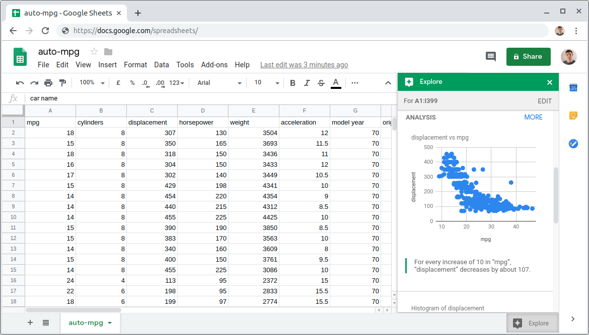 Screenshot of Google Spreadsheets Explore. Interface ©2019 Google.
Above: Users can click the “Explore” button within Google Spreadsheets to automatically obtain recommended visualisations for their data.
Screenshot of Google Spreadsheets Explore. Interface ©2019 Google.
Above: Users can click the “Explore” button within Google Spreadsheets to automatically obtain recommended visualisations for their data.
Microsoft Excel includes a “Recommended Charts” feature (as of Excel 2013) to provide the user with a ranked list of suggests for the most appropriate chart type(s) for a dataset. Microsoft’s patent (Microsoft 2013) for this feature describes a heuristic system of “static scores and score multipliers” that depend on the order of columns (e.g., “If the series is the leftmost column, category series score +1”) and distinct values (e.g., “If the number of distinct values divided by the number of values is less than 0.5, value series score −1”). The rationale for these heuristics is not provided.
Microsoft Power BI includes a “Quick Insights” feature (Ding 2019) that searches for interesting statistical properties of a dataset to visualise. The statistical patterns it searches for (correlation, seasonality, outliers, change point, etc.) are pre-specified and associated with “interestingness” scores to chose which to prioritise.
Tableau includes a “Show Me” feature (Mackinlay 2007) that uses heuristics (based on established design principles) to recommend the most appropriate chart type(s) for a dataset. Internally Tableau uses a proprietary visualisation grammar called “VizQL”.
| System | Contextual Factors | Data Patterns | Machine Learning | Design Principles | Visualisation Types |
|---|---|---|---|---|---|
| Google Sheets Google 2018 | No | Multi-column statistics | Patent Pending | Annotations | Google Sheets Charts |
| Excel Microsoft 2013 | Order of columns | Distinct values | No | Heuristics | Excel Charts |
| Power BI Ding 2019 | No | Multi-column statistics, Significance | No | Insight scores | Aggregation Query |
| Tableau Mackinlay 2007 | No | No | No | Heuristics | VizQL grammar |
Above: Recent versions of Google Sheets, Excel, Power BI, and Tableau all include some form of Visualisation Recommender System. However, with the possible exception of Google Sheets, these appear to be based on heuristics closely coupled to the system.
Gaps
Capturing Context
With the exception of Draco, none of the visualisation recommender systems attempted to elicit the user intent or visualisation context beyond the ability to flag/infer a column as important. Even in Draco, the task type is just a binary flag to indicate a “summary” or “value” task.
Recommender systems could go further by supporting personalised user profiles. For example, if a user has a particular form of colour blindness, the recommender system should take this into account when suggesting visualisations. Draco is the most extensible in this regard—a user with colour-blindness could potentially express this as a constraint and add it to Draco’s rule-set to avoid visualisation recommendations that contain ambiguous colours.
A possible explanation for the lack of context consideration by recommender systems is the difficulty of obtaining training data. One may find a source of ‘good’ visualisations, but it is difficult to determine the context they were designed for.
Support for Network Data and User Interactions
The current systems assume tabular data and focus on conventional bar, pie, line and scatter charts. However, real-world data may be better modelled and visualised as networks. For example, transport data is a network of link flows between nodes that should be visualised on a map. At a more abstract level, flowcharts, mindmaps, and UML diagrams can be thought of as forms of network visualisations for conceptual data.
Vega-Lite is used as the visualisation grammar by both Draco and Data2Vis. The Vega-Lite visualisation grammar itself contains some limited support for both user interaction as well as geographic maps and links. However, currently Draco does not support these features as it only searches a subset of Vega-Lite and does not contain any design constraints necessary to guide evaluation of visualisations incorporating these features. In theory, Data2Vis could learn to generate interactive visualisations and geographic maps given sufficient training data; however, these were not included in its default training dataset.
 Above: A domain specific visual notation for analysing transport network data. Could visualisation recommender systems be extended to design such notations automatically?
Conclusion
The rise of visualisation recommender systems that can automatically refine their own rules is an exciting development. However, currently these are limited to suggesting simple visualisation types (such as bar, pie, line, and scatter plots) rather than searching out novel visualisation solutions. In theory, searching a more complete visualisation grammar would facilitate recommendation of interactive visualisation types and increase support for network datasets. However, this will require finding ways to integrate visual design heuristics with user interaction design heuristics, as well as algorithms to guide the exploration of the larger search space.
References
- Bertin 1983
- Bertin, J., 1983. Semiology of graphics. University of Wisconsin Press, Madison, Wis.
- Degbelo 2018
- Degbelo, A., Kray, C., 2018. Intelligent geovisualizations for open government data (vision paper), in: Proceedings of the 26th ACM SIGSPATIAL International Conference on Advances in Geographic Information Systems - SIGSPATIAL ’18. pp. 77–80. https://doi.org/10.1145/3274895.3274940
- Dibia 2019
- Dibia, V., Demiralp, C., 2019. Data2Vis: Automatic Generation of Data Visualizations Using Sequence to Sequence Recurrent Neural Networks. IEEE Comput. Grap. Appl. 1–1. https://doi.org/10.1109/MCG.2019.2924636
- Ding 2019
- Ding, R., Han, S., Xu, Y., Zhang, H., Zhang, D., 2019. QuickInsights: Quick and Automatic Discovery of Insights from Multi-Dimensional Data, in: Proceedings of the 2019 International Conference on Management of Data - SIGMOD ’19. pp. 317–332. https://doi.org/10.1145/3299869.3314037
- Google 2018
- Google, 2018. Generating charts from data in a data table. Patent US20180088753A1
- Hu 2019
- Hu, K., Bakker, M.A., Li, S., Kraska, T., Hidalgo, C., 2019. VizML: A Machine Learning Approach to Visualization Recommendation, in: Proceedings of the 2019 CHI Conference on Human Factors in Computing Systems - CHI ’19. pp. 1–12. https://doi.org/10.1145/3290605.3300358
- Key 2012
- Key, A., Howe, B., Perry, D., Aragon, C., 2012. VizDeck: self-organizing dashboards for visual analytics, in: Proceedings of the 2012 International Conference on Management of Data - SIGMOD ’12. p. 681. https://doi.org/10.1145/2213836.2213931
- Luo 2018
- Luo, Y., Qin, X., Tang, N., Li, G., 2018. DeepEye: Towards Automatic Data Visualization, in: 2018 IEEE 34th International Conference on Data Engineering (ICDE). pp. 101–112. https://doi.org/10.1109/ICDE.2018.00019
- Mackinlay 1986
- Mackinlay, J., 1986. Automating the design of graphical presentations of relational information. ACM Trans. Graph. 5, 110–141. https://doi.org/10.1145/22949.22950
- Mackinlay 2007
- Mackinlay, J., Hanrahan, P., Stolte, C., 2007. Show Me: Automatic Presentation for Visual Analysis. IEEE Trans. Visual. Comput. Graphics 13, 1137–1144. https://doi.org/10.1109/TVCG.2007.70594
- Microsoft 2013
- Microsoft, 2013. Chart Recommendations. Patent US20130080444A1
- Moody 2009
- Moody, D., 2009. The “Physics” of Notations: Toward a Scientific Basis for Constructing Visual Notations in Software Engineering. IEEE Trans. Software Eng. 35, 756–779. https://doi.org/10.1109/TSE.2009.67
- Moritz 2019
- Moritz, D., Wang, C., Nelson, G.L., Lin, H., Smith, A.M., Howe, B., Heer, J., 2019. Formalizing Visualization Design Knowledge as Constraints: Actionable and Extensible Models in Draco. IEEE Trans. Visual. Comput. Graphics 25, 438–448. https://doi.org/10.1109/TVCG.2018.2865240
- Obie 2017
- Obie, H.O., 2017. Data — Driven visualisations that make sense, in: 2017 IEEE Symposium on Visual Languages and Human-Centric Computing (VL/HCC). pp. 313–314. https://doi.org/10.1109/VLHCC.2017.8103486
- Perry 2013
- Perry, D., Howe, B., Key, A.M.F., Aragon, C., 2013. VizDeck: Streamlining Exploratory Visual Analytics of Scientific Data. in: iConference 2013 Proceedings. pp. 338–350. http://hdl.handle.net/2142/36044
- Satyanarayan 2017
- Satyanarayan, A., Moritz, D., Wongsuphasawat, K., Heer, J., 2017. Vega-Lite: A Grammar of Interactive Graphics. IEEE Trans. Visual. Comput. Graphics 23, 341–350. https://doi.org/10.1109/TVCG.2016.2599030
- Wickham 2010
- Wickham, H., 2010. A Layered Grammar of Graphics. Journal of Computational and Graphical Statistics 19, 3–28. https://doi.org/10.1198/jcgs.2009.07098
- Wilkinson 2005
- Wilkinson, L., 2005. The Grammar of Graphics, Statistics and Computing. Springer-Verlag, New York. https://doi.org/10.1007/0-387-28695-0